|
|
Post by nutsberryfarm 🏜 on Jun 19, 2017 20:45:16 GMT
|
|
|
|
Post by TheGoodMan19 on Jun 19, 2017 20:51:33 GMT
Looks like the flag of some banana republic
|
|
|
|
Post by nutsberryfarm 🏜 on Jun 19, 2017 22:48:01 GMT
looks like winning to me!
|
|
|
|
Post by Terrapin Station on Jun 19, 2017 22:50:49 GMT
I like those a lot more than the recent trend of very minimalist, very BORING, mostly white/grey uniforms.
It also drives me crazy that almost everyone who has any color in their uniforms has either red or blue, with the occasional orange. BOOOORRRING.
|
|
|
|
Post by TheGoodMan19 on Jun 19, 2017 23:15:35 GMT
looks like winning to me! Sorry, I'm the traditionalist. I don't even like the colored tops. Growing up in the 70's , with the Indians all Red unis. They looked like nine used tampons. |
|
|
|
Post by No_Socks_Here on Jun 20, 2017 0:17:14 GMT
I am a traditionalisy also. White for home unis and grey for the road. Color accents accepted.
|
|
|
|
Post by President Ackbar™ on Jun 20, 2017 0:27:51 GMT
|
|
|
|
Post by devonrex68 on Jun 20, 2017 3:11:50 GMT
|
|
|
|
Post by someguy on Jun 20, 2017 3:30:24 GMT
I'm partial to the retro Astros jerseys.  |
|
|
|
Post by nutsberryfarm 🏜 on Jun 20, 2017 7:21:31 GMT
|
|
|
|
Post by WarrenPeace on Jun 20, 2017 8:23:43 GMT
1980s Milwaukee Brewers. Not only did they have the pinstripes but also a nicer shade of blue and the best logo in all sports of all time.  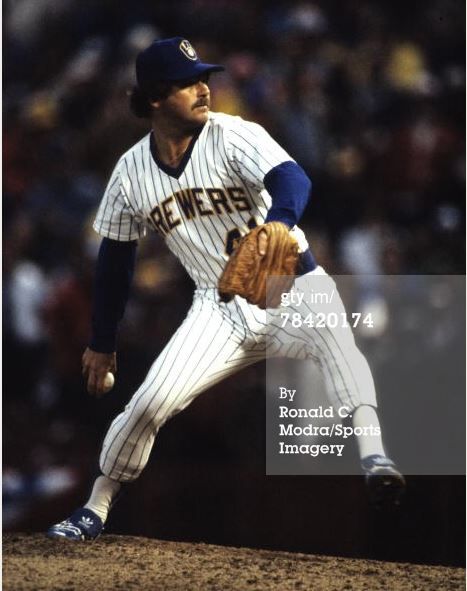  |
|
|
|
Post by xystophoros on Jun 20, 2017 13:50:34 GMT
I'm partial to the retro Astros jerseys. These Astros "rainbow" uniforms come up in every one of these discussions, especially since they're garish by modern standards. The font is extremely 70s too, and you can see the same design aesthetic in the NASA mission badges and logos of the time. I like them precisely because they're so memorable and unusual, and because that was when Houston embraced space/NASA imagery into its pro sports uniforms. Here's a Houston Rockets logo from 1971-1972:  Edit: Look at these 1970s Skylab patches:    |
|
Deleted
Deleted Member
@Deleted
Posts: 0
Likes:
|
Post by Deleted on Jun 20, 2017 17:11:44 GMT
Ha ha! I remember those! It was "Futuristic Night" at the Kingdome. I thought they rocked back then. |
|
|
|
Post by devonrex68 on Jun 21, 2017 3:21:37 GMT
Ha ha! I remember those! It was "Futuristic Night" at the Kingdome. I thought they rocked back then. Lol.You do remember."Futuristic Night" was when the Kingdome was the "Biodome". |
|
|
|
Post by mecano04 on Jun 21, 2017 16:24:20 GMT
|
|
|
|
Post by President Ackbar™ on Jun 21, 2017 16:34:47 GMT
|
|
|
|
Post by TheGoodMan19 on Jun 21, 2017 17:36:12 GMT
I'll settle this "coolest uni" debate now 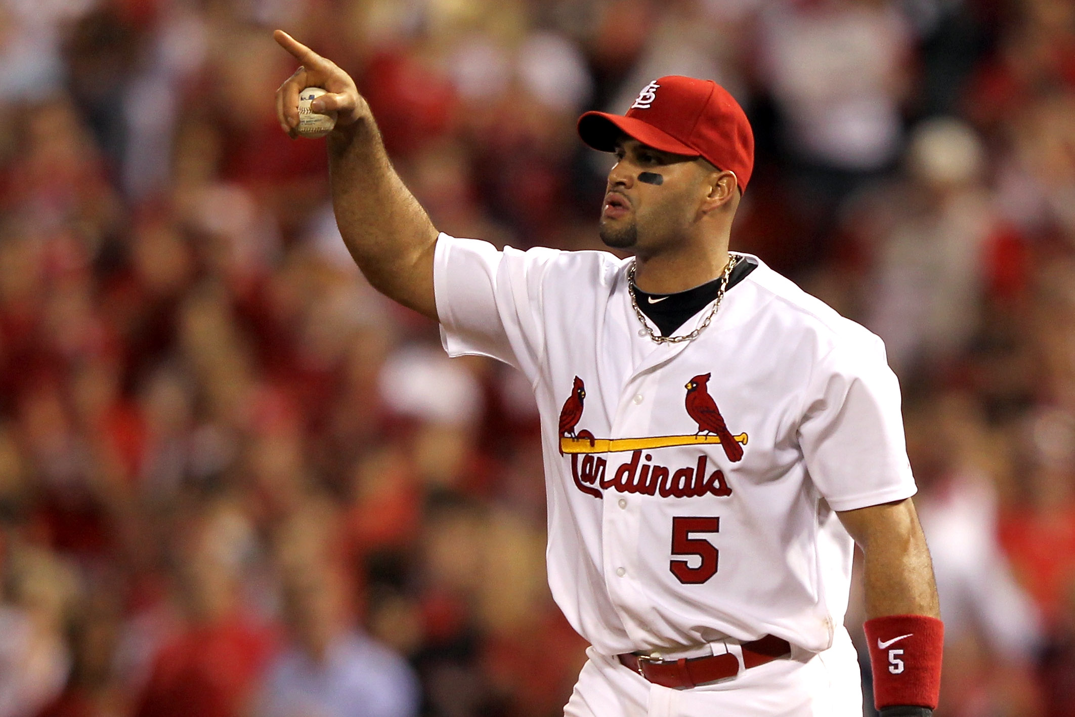 The birds on the bat. Doesn't get cooler than that. Cooler that the "Dodgers" Script, the olde English "D", the olde English "Red Sox", even the pinstripes. |
|
|
|
Post by President Ackbar™ on Jun 21, 2017 17:57:25 GMT
|
|
theshape25
Sophomore

@theshape25
Posts: 877
Likes: 536
 
|
Post by theshape25 on Jun 22, 2017 0:58:45 GMT
As a kid growing up in the 80's that's what I always thought their logo said. |
|
|
|
Post by nutsberryfarm 🏜 on Jun 22, 2017 20:52:29 GMT
|
|