Deleted
Deleted Member
@Deleted
Posts: 0
Likes:
|
Post by Deleted on Mar 16, 2018 17:23:29 GMT
  My God. It's not enough that their movies are the same. Now the posters have to be the same too. |
|
|
|
Post by Daisy on Mar 16, 2018 17:25:00 GMT
They look pretty damn good to me.
|
|
|
|
Post by Rey Kahuka on Mar 16, 2018 17:43:08 GMT
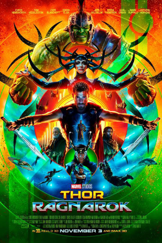
I've always loved the Ragnarok poster. That Infinity War poster looks fan made, are we sure it's legit? I get that they're just trying to cram everyone in the film onto one poster, but in particular Wong and Vision look tacked on-- as if they were making a list of who needed to be on the poster and somebody remembered those two at the last minute. Conceptually I don't hate it aside from being too similar to the format of the Ragnarok poster, but it's just too damn crowded. Let's hope that's not indicative of the film itself.
|
|
|
|
Post by politicidal on Mar 16, 2018 17:56:27 GMT
Thor: Ragnarok's poster looked awesome. The issue with Infinity War is that there's not enough contrast to make it eye catching.
|
|
|
|
Post by scabab on Mar 16, 2018 18:27:25 GMT
They do look good but I see what you mean. This is something I've seen brought up before. If you look at this image.  You can a lot of similarities, particularly with Iron Man 3 and Thor Dark World and then also Iron Man and Spider-man Homecoming and finally Captain America and Ant-man. Even this Black Panther poster shares the same kind of design as those in the OP.  Their posters usually try and shove as much of the cast into the poster as possible. But otherwise they look good enough, the Thor Ragnarok and Guardians of the Galaxy 2 posters were particularly good. |
|
|
|
Post by Tristan's Journal on Mar 16, 2018 18:39:17 GMT
what do you mean "getting"...?
The standardized layout is part of the formula since ever, signaling to their Marvel audience: "You get the same formula repainted for full price" - they try the same with Star wars too but the law of diminishing returns seems to apply there unlike with Disney-Marvel. Artistically ultra-lazy, but a brilliant business concept if you have a fanbase gladly buying it.
The Infinity War poster looks fan made though, the colors and contrast are amateurish as if made by a color-blind person (no offence).
|
|
|
|
Post by Rey Kahuka on Mar 16, 2018 18:48:37 GMT
They do look good but I see what you mean. This is something I've seen brought up before. If you look at this image. You can a lot of similarities, particularly with Iron Man 3 and Thor Dark World and then also Iron Man and Spider-man Homecoming and finally Captain America and Ant-man. Even this Black Panther poster shares the same kind of design as those in the OP.
Their posters usually try and shove as much of the cast into the poster as possible. But otherwise they look good enough, the Thor Ragnarok and Guardians of the Galaxy 2 posters were particularly good. This is usually the problem, and it's most apparent on the Avengers posters because of course they feature the largest casts of prominent characters. I still think the first Iron Man and Cap posters are great, along with Ragnarok. This IW poster is overcrowded but at least it's organized. The previous two Avengers posters look like a kid randomly put stickers of the characters on a blank canvas and called it a poster. I'll say this: it's a no-win situation, because I'm sure they were trying to avoid backlash if they excluded even the most minor of supporting characters in a movie this big. "Figures they left out Wong!" Either way it's an uninspiring poster even if it is an improvement over previous Avengers posters. |
|
|
|
Post by President Ackbar™ on Mar 16, 2018 19:09:30 GMT
They are ashamed of comic book movie posters !!!!!!!!1!!!!!!!!1
|
|
|
|
Post by sostie on Mar 16, 2018 19:20:43 GMT
Conceptually I don't hate it aside from being too similar to the format of the Ragnarok poster, but it's just too damn crowded. Let's hope that's not indicative of the film itself. I like them because they hark back to the days when film posters were great pieces of art/decoration. You don't get it so much anymore but cramming as much as you could on a poster was quite common, especially the 70s and 80s. Just look at the original, and special edition, Star Wars posters - it was the standard for blockbuster (and wannabe blockbuster) movies. My film poster collection sort of diminishes after the early 90's and one reason is a lot of designs were so bland. If I still bothered to collect, Marvel would be some I would probably buy. Also, I like that there is a semblance of branding or consistency. Something I like seeing in my record collection as well. |
|
|
|
Post by kleinreturns on Mar 16, 2018 19:45:39 GMT
AWESOME POSTERS!!!
|
|
|
|
Post by Hauntedknight87 on Mar 16, 2018 20:03:33 GMT
Not going to lie, I was hoping they would have modeled the poster after the infinity Gauntlet cover art.
|
|
|
|
Post by formersamhmd on Mar 16, 2018 20:06:30 GMT
So you're upset at their consistency?
|
|
|
|
Post by Rey Kahuka on Mar 19, 2018 11:50:19 GMT
Conceptually I don't hate it aside from being too similar to the format of the Ragnarok poster, but it's just too damn crowded. Let's hope that's not indicative of the film itself. I like them because they hark back to the days when film posters were great pieces of art/decoration. You don't get it so much anymore but cramming as much as you could on a poster was quite common, especially the 70s and 80s. Just look at the original, and special edition, Star Wars posters - it was the standard for blockbuster (and wannabe blockbuster) movies. My film poster collection sort of diminishes after the early 90's and one reason is a lot of designs were so bland. If I still bothered to collect, Marvel would be some I would probably buy. Also, I like that there is a semblance of branding or consistency. Something I like seeing in my record collection as well. The Star Wars posters had a lot going on, but they seemed more organized. I do agree movie posters are a lost art. They're not as important in terms of advertising in the modern age, and the lack of effort really shows in most cases. |
|