|
|
Post by blockbusted on Dec 28, 2017 19:27:48 GMT
Remember how 'Captain America' sequels and 'Guardians of the Galaxy' films tells you the location of the setting by using texts somewhere?
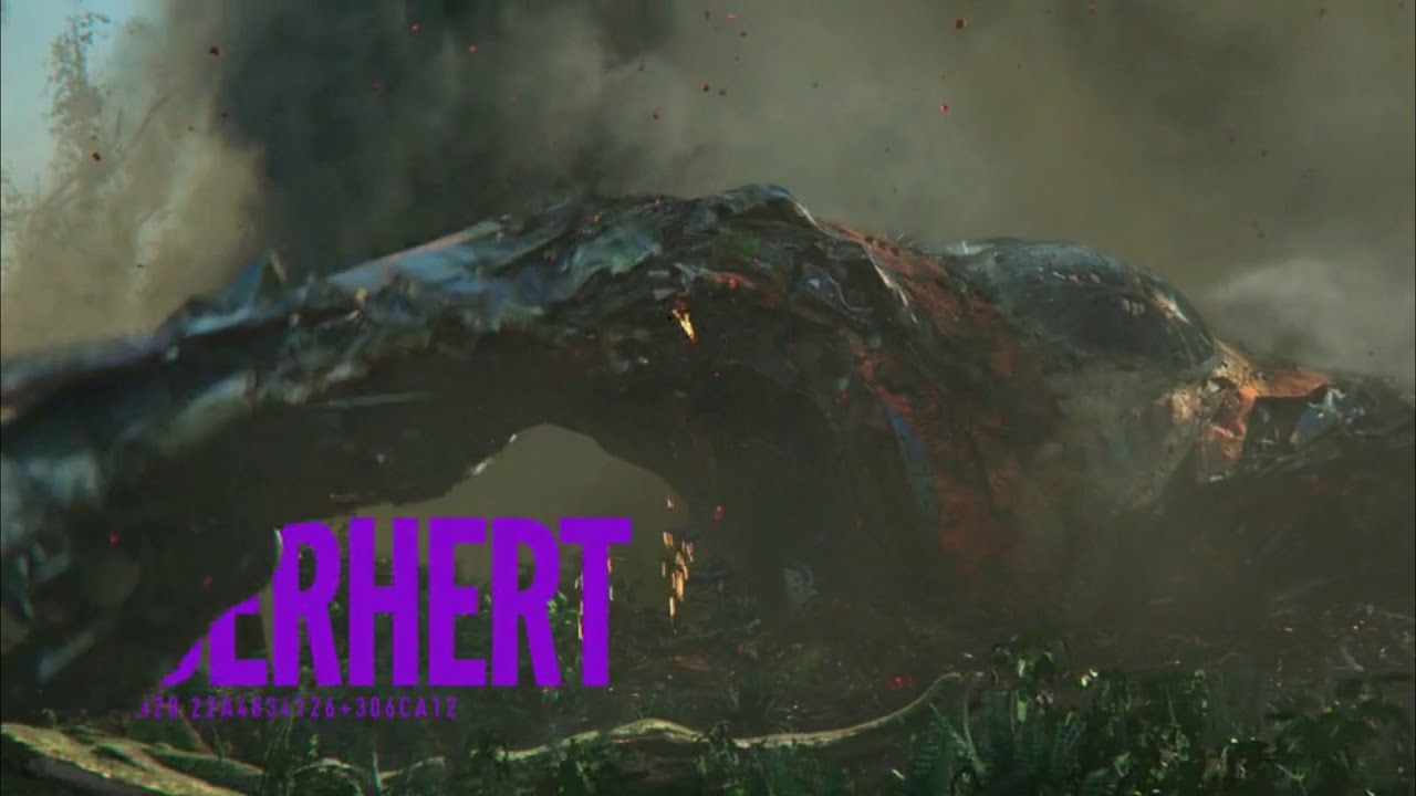
Yeah, I'm not really a fan of how they handled that in 'Captain America: Civil War' and 'Guardians of the Galaxy Vol. 2':


The method used in 'Captain America: Civil War' feels rather intrusive and the method used in 'Guardians of the Galaxy Vol. 2' feels... weird.
Now, compare those with ones used in 'Captain America: The Winter Soldier' and 'Guardians of the Galaxy':


Sorry that the latter image is too small, but seriously, those location "cards" they used previously were perfect. Why did they decide to change them? |
|
|
|
Post by sdrew13163 on Dec 28, 2017 22:57:06 GMT
I always thought the lettering in CA: CW was kinda weird in the way it essentially covered the whole screen, but I don't think it necessarily looks bad.
|
|
|
|
Post by blockbusted on Dec 28, 2017 22:58:58 GMT
I always thought the lettering in CA: CW was kinda weird in the way it essentially covered the whole screen, but I don't think it necessarily looks bad. It didn’t look “bad”, but it kind of felt intrusive and somewhat annoying. |
|
Deleted
Deleted Member
@Deleted
Posts: 0
Likes:
|
Post by Deleted on Dec 29, 2017 1:29:29 GMT
I thought I was the only one who hated that. It's so obnoxious. I thought the same thing when I saw Quantum of Solace in theaters.
|
|
|
|
Post by politicidal on Dec 29, 2017 1:31:55 GMT
Well 'weird' is probably what they were going for. But if you can't read it, what's the point? The ones for CA: CW I don't remember bothering me that much.
|
|
Deleted
Deleted Member
@Deleted
Posts: 0
Likes:
|
Post by Deleted on Dec 29, 2017 16:59:47 GMT
What?!
You dare say something negative about the MCU?!
Dc-fanboy spotted!!!
Red Alert!!!
Those giant letters are key to phase three. It was Foggy Nelson who enlarged them on his office copymachine.
How dare you!!!
#teamcolden
|
|